the design system
Laying the Groundwork for Scalable UX
To ensure consistency and scalability across a fragmented product ecosystem, a unified design system was essential. At the time, there was little shared understanding of what a design system could enable—components were inconsistent, handoff was manual, and design debt was growing. Recognizing the gap, I advocated for a systemized approach to design and took the lead in building and maintaining it.
From this….
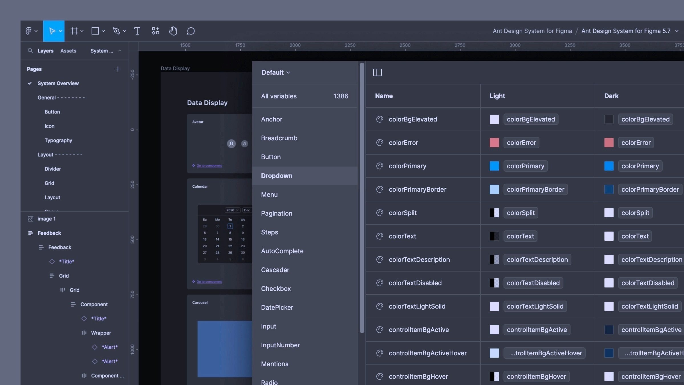
A marketing-supplied color palette and a loosely assembled set of UI components from the third-party vendor—mostly detached from the wireframes, with no use of Figma’s component architecture, variables, or publishable styles, making updates and scalability nearly impossible.
to this…
Note: Certain elements have been blurred or minimized intentionally to maintain confidentiality—what’s shown is meant to highlight structure, logic, and system thinking, not specific product data.
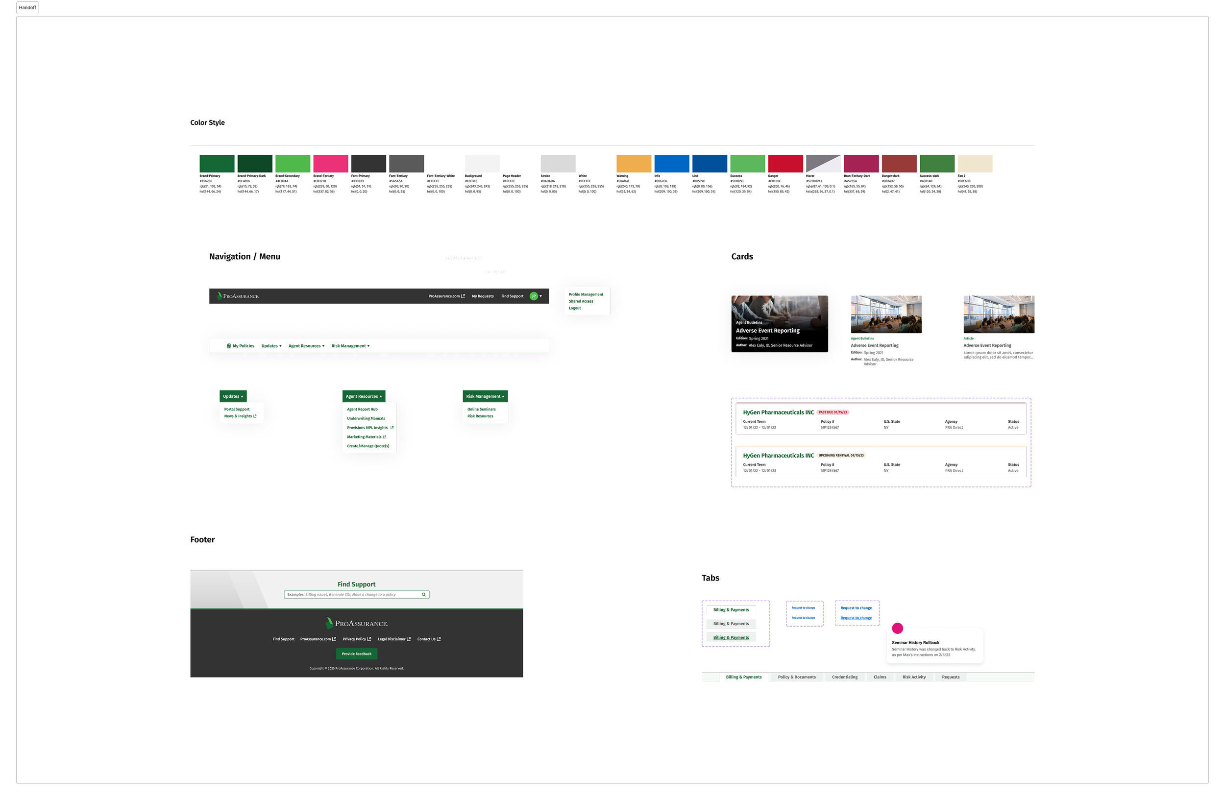
Designed for flexibility and cohesion, it unified UI patterns across multiple brands, business units, and user roles. It went on to include five brand-specific style guides, clear documentation, and close collaboration with engineering and external partners to ensure seamless implementation and long-term maintainability.
A centralized library of over 100 components, covering form controls, tables, modals, notifications, and more — each built with variant logic and tokenized styles for theme adaptability.

Note: Certain elements have been blurred or minimized intentionally to maintain confidentiality—what’s shown is meant to highlight structure, logic, and system thinking, not specific product data.
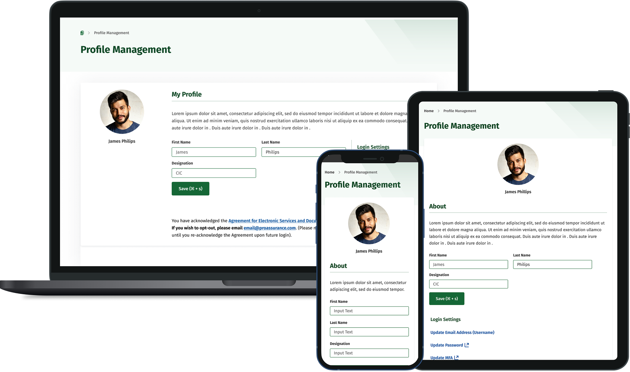
A System Built for Every Screen
Designed to support responsive experiences across desktop, tablet, and mobile, the system brought consistency to a complex, multi-brand product ecosystem.
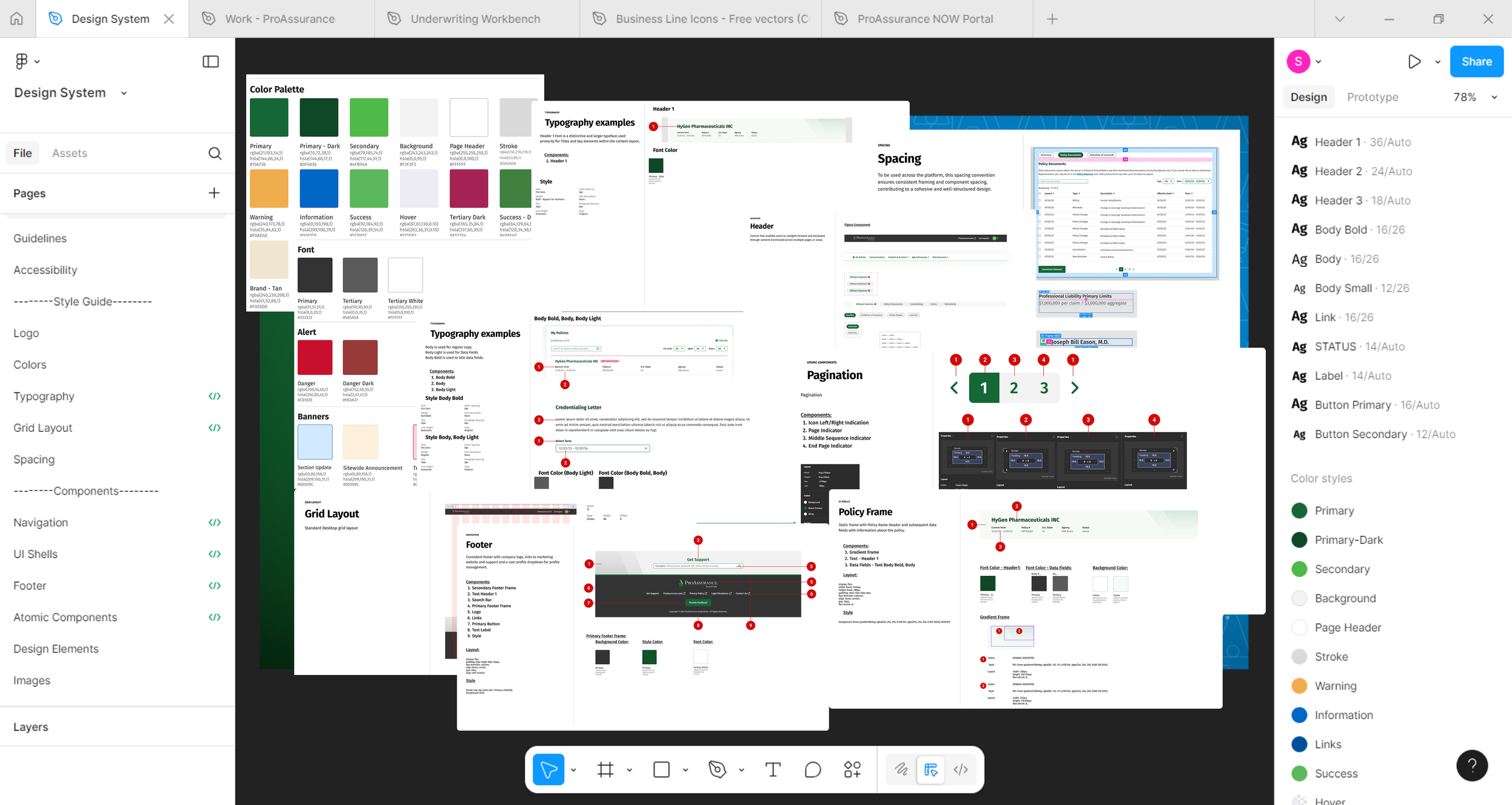
an example…
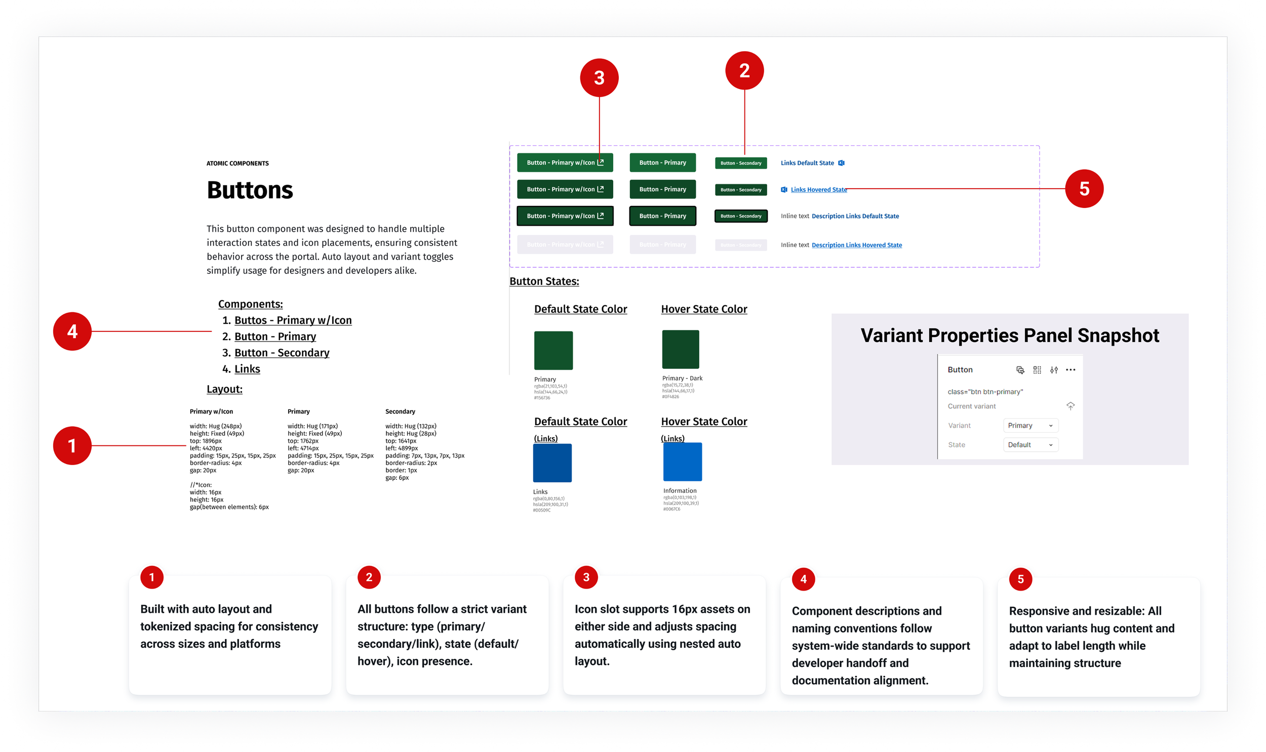
A flexible, variant-driven button system supporting multiple interaction states, icon placements, and usage contexts, from standalone CTAs to inline links.
an example…
A flexible, variant-driven button system supporting multiple interaction states, icon placements, and usage contexts, from standalone CTAs to inline links.
Note: Certain elements have been blurred or minimized intentionally to maintain confidentiality—what’s shown is meant to highlight structure, logic, and system thinking, not specific product data
Documentation
The primary documentation is maintained directly in Figma, using component descriptions and variant labels. With the release of Figma’s presentation slide feature earlier this year, a separate visual guide was created for product stakeholders, focusing solely on design usage and style guidance, without developer-specific details.
Maintenance & Governance
Component maintenance is ongoing, with monthly audits to ensure consistency and identify deprecated patterns. Updates follow an industry-standard request-review-release process: the product team submits change proposals, which are reviewed by a small governance group before being versioned into the main library.
Code Handoff
Developer handoff is managed through Figma Dev Mode, with additional iteration files providing visual annotations and edge-case handling. All components are structured for clarity—matching token naming conventions and layout specs to reduce friction during implementation.
A fully structured, tokenized design system built in Figma—featuring responsive, reusable components, brand-specific theming, and documented usage patterns to support consistent, scalable design across teams and platforms.
This case study represents a selection of work completed as Lead UX Designer on the ProAssurance Digital Experience Platform between 2022–2025. Most design elements cannot be shown, and business details have been modified or omitted to respect confidentiality. For an in-depth review, please contact me at sarahadi.work@gmail.com