
Simplifying Insurance Quotations for MPL Agents
A digital application designed to streamline the quick-quote
process for insurance agents, enhancing speed, accuracy,
and usability.
process snapshot
UX strategy
the tools
Design goals
Simplify data entry for agents
Reduce cognitive load
Enable conditional logic for cleaner UI
Constraints & Considerations
Full backend compatibility with existing systems
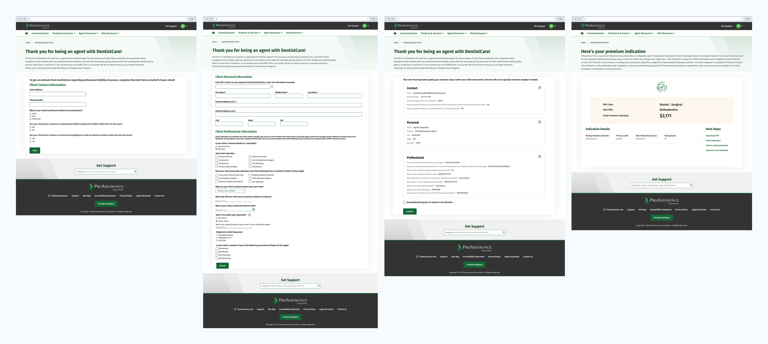
Large form with mandatory fields
Limited autofill options despite using NPI
Outcomes
Faster quote creation
Positive feedback from agents post-release
Increased navigation clarity and task completion
The user
ProAssurance is a major provider of medical professional liability insurance. Their network of agents work directly with healthcare providers to generate quotes and onboard new clients. These agents needed a more intuitive and efficient way to generate non-binding quotes—especially for returning clients—without going through lengthy paperwork or multiple disconnected tools.
The Challenge
Agents were manually collecting and inputting extensive information across various documents and tools to generate quotes, often resulting in delays and inconsistencies. Despite the availability of unique identifiers like the National Provider Identifier (NPI), the process remained time-consuming.
The primary UX challenge?
Inefficiencies caused by redundant inputs, poor visibility into application status, and limited automation to handle straightforward cases.
The Solution
The challenge was approached with a focus on efficiency and real-world workflow alignment, balancing agents’ need for speed and flexibility with underwriters’ requirements for complete, accurate data behind the scenes. The solution focused on simplifying the agent experience through empathy-led design — eliminating redundant tasks, clarifying application progress, and introducing automation to speed up straightforward quotes.
Understanding the Humans Behind the Workflow
The process began with direct conversations with MPL agents, the individuals using the tool daily. For them, a “quick” quote wasn’t just about speed; it meant confidence, accuracy, and not having to backtrack. These interviews revealed key pain points:
Redundancy in Data Entry
Agents repeatedly entered the same information across multiple fields and documents, creating inefficiencies and increasing the likelihood of errors.Lack of Field Logic
Forms didn’t adapt dynamically to user input, forcing agents to complete irrelevant fields or make manual adjustments.Unclear Status Indicators
Agents often couldn’t tell at a glance whether an application was pending, approved, or required additional review, leading to extra follow-ups and confusion.Time Management Delays
Applications that could have been auto-approved were mixed with cases needing manual checks, such as claims verification or retroactive coverage reviews, slowing overall turnaround.
Bridging Ideas and Execution
To gain a broader perspective, competitive analysis was conducted on both direct and indirect competitors to identify best practices in digital application design. Key insights included:
Progressive disclosure: Breaking complex forms into smaller, manageable steps improved usability and reduced cognitive load.
Conditional logic: Fields dynamically appeared or hid based on prior answers, simplifying the experience.
For example, selecting “No” for certain eligibility questions automatically hid irrelevant secondary questions, and choosing a specific practice type removed unnecessary follow-ups related to other specialties.
Clear progress indicators: Users could easily see which step they were on and what remained, reducing uncertainty and errors.
Inline guidance and contextual help: Best-in-class applications provided subtle prompts, tooltips, or explanations that helped users complete fields accurately without leaving the form.
Error prevention and validation: Real-time validation prevented users from submitting incomplete or inconsistent data, reducing the need for corrections later.

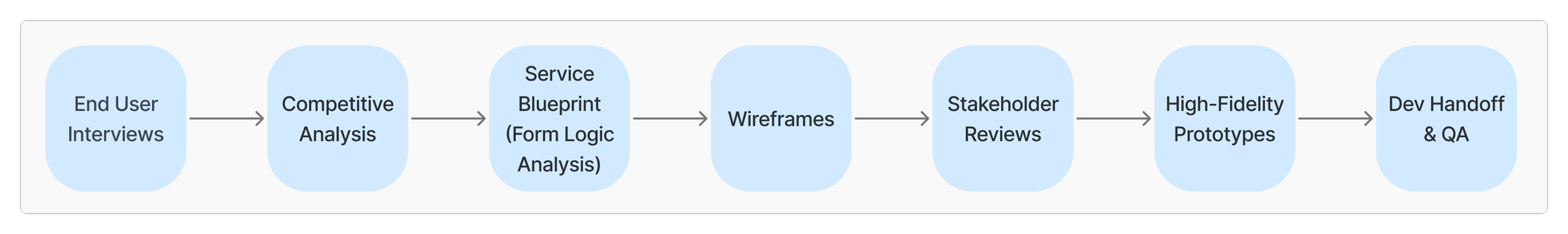
This research informed the Form Logic Analysis, conducted in collaboration with the developer and underwriter. Together, we:
Mapped dependencies between fields and rules in the application, ensuring that conditional logic aligned with compliance and underwriting requirements.
Built a service blueprint to visualize the end-to-end workflow, highlighting touchpoints between the agent, system, and backend processes.
Defined actionable logic rules and technical constraints, which guided the engineering team in implementing a dynamic, user-friendly application that stayed compliant.

Designing with Intention
After synthesizing insights from agent interviews and findings from market research, a clear contrast emerged between what users wanted and what competitors were offering.
While competitive tools often relied on step-by-step progressive disclosure — breaking the process into smaller screens — agents described that approach as too click-heavy and time-consuming. Their priority was speed: completing an application with as few clicks and transitions as possible while maintaining accuracy and clarity.
This difference highlighted a key contextual nuance — most competitor tools were designed for both agents and direct insureds seeking self-service quotes, whereas our application was exclusively for professional agents who were already familiar with the forms and terminology.
Recognizing this, I explored two design directions:
A traditional, scrollable layout with smart conditional logic and NPI-based autofill to reduce redundancy.
A progressive disclosure model using horizontal steps and a progress bar to visually guide the user through the process.
Both prototypes were tested with agents through A/B testing. The results clearly favored the traditional design, despite its scrollable format. Agents found it faster, appreciated that irrelevant fields were automatically hidden, and felt it gave them a better sense of control and momentum through the application process.
results & Next steps
The redesigned quoting experience felt truly agent-centric — built around speed, clarity, and confidence in the process.
Key results and improvements:
Streamlined quoting workflow:
Redundant data entry was reduced through NPI integration and conditional logic, making the application faster and more accurate to complete.Smarter time management:
Automation separated quick-quote applications from those requiring manual checks (like claims verification or retroactive coverage), improving turnaround time and reducing backlogs.
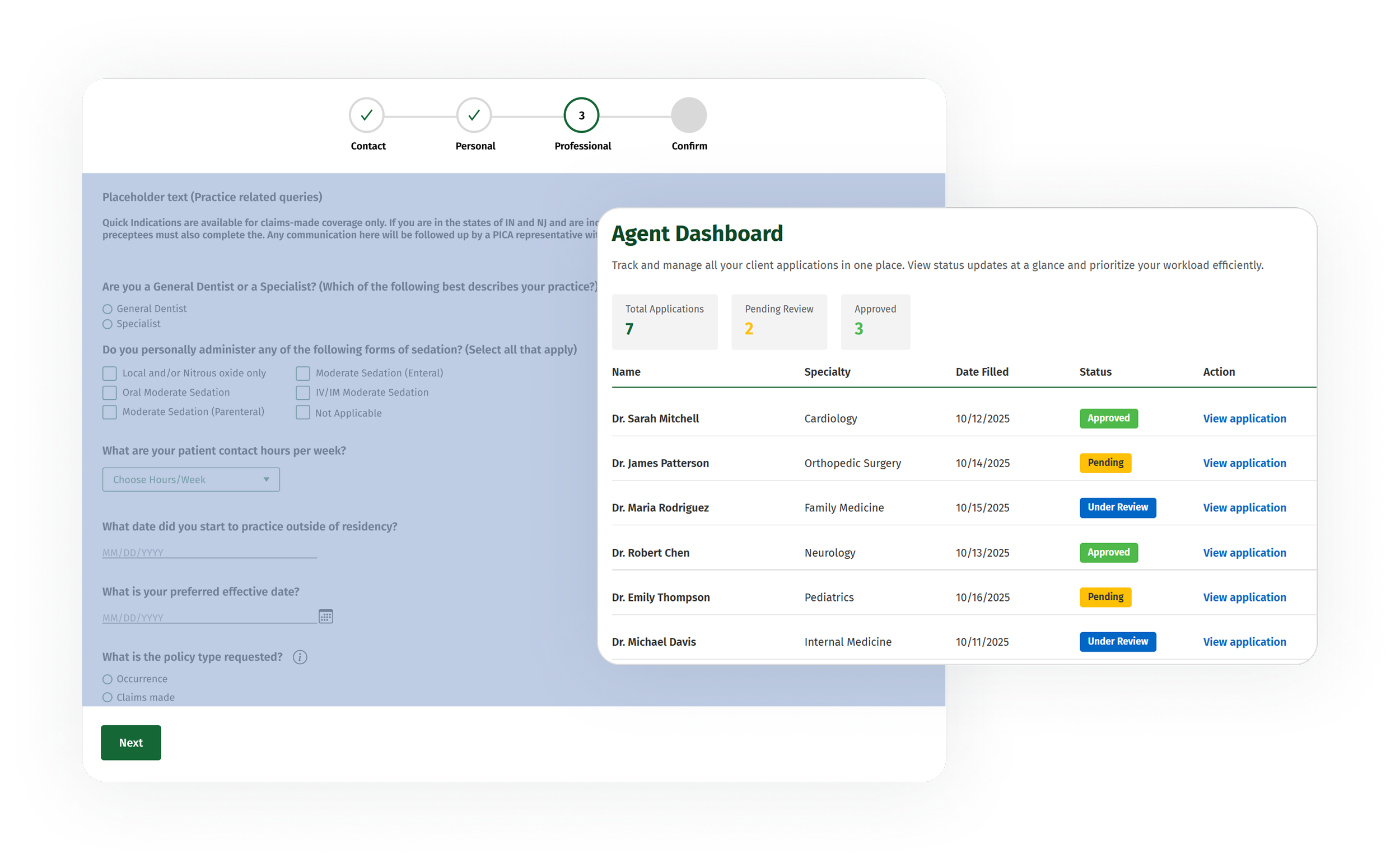
Moreover, a new Agent Landing Page was proposed and designed to address visibility and time-management challenges that surfaced during research.
Key features and impact:
At-a-glance status visibility: Agents could instantly see whether each application was pending, approved, or under review, eliminating uncertainty and manual check-ins.
Prioritization support: The clear status overview helped agents organize their workload, focusing first on applications that required immediate attention.
Reduced operational friction: By centralizing status updates and application tracking, agents spent less time following up and more time serving clients.
Overall, the redesign delivered a faster, more intelligent, and more transparent experience — helping agents work efficiently while building greater trust in the digital process. Although this first release focused on straightforward, low-risk applications, it laid the foundation for expanding the experience to other product lines and coverage types within the portfolio.
This case study represents a selection of work completed as Lead UX Designer on the ProAssurance Digital Experience Platform between 2022–2025. Most design elements cannot be shown, and business details have been modified or omitted to respect confidentiality. For an in-depth review, please contact me at sarahadi.work@gmail.com